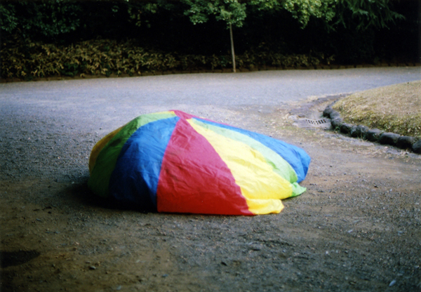
Design For Mankind

jacquie bos arthouse http://www.plywerk.com/ ruby plaza crywolf clothing burke decor pistachio press paper doll jessalinb"/ alibli some prints indiobay pretty little thieves caesarstone stoneandhoney.com advertise_here

jay waldron.

jay-waldron

Jay has a great portfolio, but what I really love is how he categorizes his sets. The photo above is from the collection ‘colors,’ and I don’t think there could be a more accurate description.

Link: JAY WALDRON.

Share:
  • Facebook
  • Twitter
  • Tumblr
  • StumbleUpon
  • Google Bookmarks
  • Kirtsy
  • Digg
  • del.icio.us
  • RSS
  • email
  • Print

9 Comments »

  1. great portfolio – thanks for sharing!

    Erica — January 12, 2009 @ 1:13 pm
  2. that’s awesome – it looks like a big, colourful pebble.

    Anonymous — January 12, 2009 @ 4:41 pm
  3. That’s how I’m feeling after a 10 hour work day…a little deflated. ;-)

    laura @ the shorehouse. — January 12, 2009 @ 8:53 pm
  4. I wonder what’s hiding under those colors…

    Deborah — January 12, 2009 @ 9:28 pm
  5. aww… :( but what you don’t know is that under this parachute there are lots of kiddies waiting to jump up high! :)
    e

    erin — January 12, 2009 @ 9:54 pm
  6. The image right after that is awesome too!

    heather smith jones — January 13, 2009 @ 12:31 pm
  7. wonderful. i love no. 5 within the ‘feelings’ section.

    cindy k — January 13, 2009 @ 1:08 pm
  8. ME TOO!

    Design for Mankind — January 13, 2009 @ 1:23 pm
  9. Aren’t they all so good? :)

    ERIN — January 13, 2009 @ 1:23 pm

RSS feed for comments on this post. TrackBack URL

Leave a comment

Copyright © 2007-2010 Erin Loechner. All Rights Reserved.
Designformankind.com