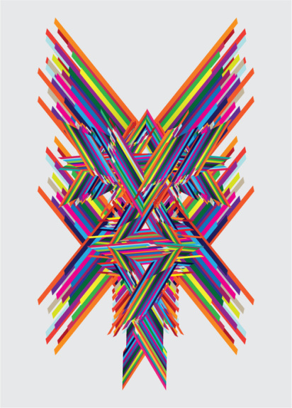
Joe’s work stood out to me from the very beginning, and he’s now the proud winner of Design for Mankind’s Society6 grant, which will give him lots of super fun and useful prizes! Stay tuned for the next grant to come, and thank you so much to all participants, applicants, and those who nominated their favorites. Most of all, thank you, Society6, for creating a platform dedicated to the expansion of art.


well deserved!
SpeedyJoe is a good maaaan
Keep up the great work, congratulations INTERNET!
congrats joe!
xo
Kelly
Wow. Beautiful colors. I love it! They are so kinetic!
congratulations to joe! his work is cool! i love this one.
Congratulations Joe!
this isnt his work. joe stole this from different artists. he follows you on flickr and steals your ideas
I read an comment about joe’s work somewhere else and I agree with Matt, this looks like MWM’s work, even the colours are exactly the same.
i’m good friends with MWM and Joe, and have been following them both for years. If you actually take a look at Joe’s portfolio you’ll see that in fact none of his work looks like Matt’s. Joe’s work is full of character illustration, loose lines and sure.. bright colors. But even his line work is 1000% different than Matt’s. Matt’s work is angular, full of layered details and patterns, and often filled with typographical elements. Sure he uses bright colors too, but so do I. Lots of people do. Get over it, and give this 22 year old a break. He’s just starting and deserves your encouragement, not your anonymous hate.
That being said, CONGRATS JOE!
I’m going to agree with UPSO– I think his work is influenced by a lot of super-great artists, but I’m not sure he’s “stealing ideas.”
The above piece looks a lot to me like Jen Stark’s paper creations, and I love that it’s reminiscent, but don’t feel it’s been stolen.
Let’s keep things positive around here, OK?
way to go joe!
Cool!
LOVE it. I would so hang this up in my house!