

Well, it seemed like many of you were pretty big fans of the last typo graphic on my favorite free fonts, so I thought I’d give you yet another list of fonts. This week I’m letting you in on my most beloved typefaces; they’re the ones I can always count on to do the trick when I’m in a sticky typeface dilemma (you get in those too, yes?)…
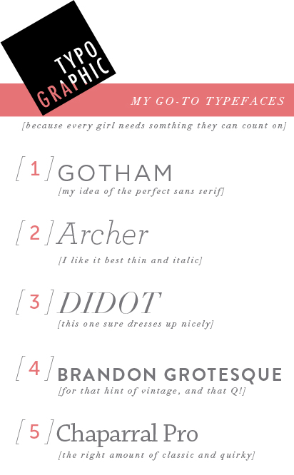
GOTHAM. This is my go-to sans serif. If you need something to look put together, clean, and modern, this is your girl!
ARCHER. I use this eeveerywheeerreee. Seriously. It was originally created for Martha Stewart’s magazine, and it has such an appealing aura to it. I’m pretty in love with the ball terminals, and how it looks in italics. I use it for my personal logo, and have tried to slip it in to as many projects where it seems at all appropriate.
DIDOT. You probably have a version of this already loaded on to your computer. I love this classic typeface for it’s ability to dress up almost anything it’s on. Instant class. I use this as headlines all over my blog.
BRANDON GROTESQUE. I feel like this is probably every graphic designer’s love right now. It combines the crispness of a typical sans serif, with a little bit of soft with it’s quirk and rounded edges. It’s really screams that it’s tough, but likable. The perfect compliment to…everything. Oh, and it’s a TDC winner!
Chaparral Pro. I don’t know where this typeface came from, or why I didn’t notice it before, but I found it on my computer and this year it has been such a lifesaver when I’m in need of a simple serif typeface that has a bit of quirk to it. It really keeps me coming back to it again and again with it’s easy usability and application.
PS: some of you last time were wondering just how to get your typefaces to work online as web fonts. Here is a lovely little video made by Jessica Hische (my type idol) all about that subject. If you haven’t been following don’t fear the internet, it’s a really great thing to look into if you’re at all interested in web design!
WOW! Thank you for the link to Don`t fear the Internet! This is a great colomn!
Yet another great font resource! Thanks again! :)
Great list.
I really love Gotham and Geo Sans. I think Brandon Grotesque is awesome as well. I feel like I stick to the neatly organized typefaces due to my personality but then secretly love the playful ones and wish I could be just as playful.
I think Didot is the font I’ve been trying to identify for awhile. Thanks!
Didot is my long time fave!
I can’t seem to get Gotham for free, can you please help? Thanks!
What is the italicized font you used for the descriptions?